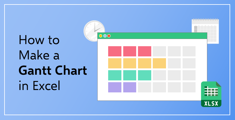
How to Make a Gantt Chart in Excel?
Do you want to learn how to make a Gantt Chart in Excel? Does it look complicated? So, we have gathered four simple and quick methods for you!
Table of Contents:
- What is The Gantt Chart Used For?
- What is the Difference between a Gantt Chart and a Network Diagram?
- What is the Difference between a Gantt Chart and a PERT Diagram?
- Gantt Chart: Pros and Cons
- How to Make a Gantt Chart in Excel: Four Methods!
The concept of project management dates back to the 1890s. It seems so long ago that a project management system such as the Gantt chart could not have possibly been created in that era. However, it is.
You can watch a 60-second tutorial first:
An engineer and project consultant Henry Gantt created the chart that bears his name in the timeframe between 1910-1915. At that time, the Gantt Chart was drawn and presented on a piece of paper. Now, technological and digital devices took their place. But the purpose of Gantt charts and the reason why they are used has never changed.

What Is the Gantt Chart Used For?
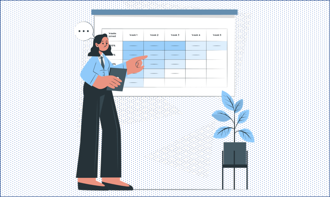
An Excel Gantt chart, in the simplest terms, is the visual representation of a project. It shows the timeline and the project plan during that time period. Not only the chart demonstrates the current status of the project but also each of the tasks and the people who are in charge of completing them.
The horizontal axis of the chart shows you the progress and the general timeline of the project. The vertical axis lists the tasks that should be done in order to complete the project. You can include the name of the employee or department in charge in one of the axes or on top of the task placed in the timeline.
It is specifically used for establishing a roadmap and clearly seeing what is done and who is done by. You can figure out the milestones you (or your team of employees) achieved during the timeline of the project as well. Think of a Gantt chart as a visually illustrated progress bar. You are able to know which tasks are done and which should be done in order to further the progress of the project.
It is an essential tool not only for project managers or supervisors but also for the team members (employees) as well. As a data analyst, an intern, or a financial consultant, you should be able to see the entire progress of the project on which you are working. Excel gantt charts can be considered as a ‘motivational tool’ as well, as you see how much you have advanced in the project and how much you have achieved.
What Is the Difference Between a Gantt Chart and a Network Diagram?
Perhaps the biggest difference is the visual one. A Gantt chart is, basically, a bar chart in which the bars stack on top of or next to each other. A Network Diagram, on the other hand, is a flowchart in which each of the tasks of the project is connected.

Gantt charts deal with time management and the schedules of tasks in the projects. While Network diagrams focus on visually representing the workflow of the project.
Gantt charts have clear start and end dates. The duration and the date of each of the tasks are written down and detailed. Network diagrams list the estimated time frames of the activities and the project in general.
While Gantt charts show the progress of the project and the progress of each of the tasks; the Network diagrams only show the tasks and the activities.

Gantt charts are quite easy to manage and incredibly suitable for adjustments and modifications. Network diagrams, on the other hand, due to the fact that they affect each other, need some additional time and effort for planning in order to change the data and details.
If you think of a Gantt chart as ‘a detailed Team To-Do List’, you can think of a Network diagram as ‘a complicated flowchart’. The only difference between a flowchart and a Network diagram is that a flowchart needs to have tasks and activities
What Is the Difference Between a Gantt Chart and a PERT Diagram?
Gantt charts can be used for basic and small projects. However, PERT (Program Evaluation and Review Technique) diagrams can take on huge and complex projects easily. The PERT was designed and developed by the United States navy in order to manage the missile missions’ planning, organizing, and testing processes. So, it is specifically created to take on hard, complex and intricate projects.
A Gantt chart is a schedule and a progress bar chart. On the other hand, a PERT diagram is, merely, a network diagram.

Gantt charts are focused on the time and the duration of each of the tasks that need to be completed. PERT diagrams are focused on the dependencies of the tasks.
Gantt charts show the flow of a project. But, the PERT diagrams show the big picture.
Recommended Reading:
Can Excel Be Used for Project Management?
Gantt Chart: Pros and Cons

Pros:
They are incredibly easy tools to use. You can get the help of Microsoft Excel in order to create your Gantt charts.
They are ‘easy to look at. Gantt charts are visual and they have colorful illustrations of the activities and their durations in a timeline.
Apart from the individual and separate tasks, you can also see the dependencies of the activities.
They are great resource management systems as well. They allow you to see who is in charge of which task so that everyone would be (literally) ‘on the same page’. So, Gantt charts help you to achieve a better level of communication between the members of the teams.
Cons:
Let’s start with the biggest disadvantage of Gantt charts: They are getting a little bit out of date with each passing day. Before certain technological developments and especially the creation and the rise of social media platforms, project plans were much more linear. With the ‘always consume’ mindset, not every project can follow a linear pattern for its workflow. In today’s world, projects lend themselves to be more accessible to the Agile method of project management systems.
If you are willing to take on the creation of a Gantt chart, you have to take on the task of updating a Gantt chart as well. Because you might have several projects at the same time and they are going to need to be updated.
Due to the fact that the timeline on the chart is horizontal, it can be difficult to see the whole plan for the project. Also, subsequently, it is hard to print a Gantt chart for a project.
How to Make a Gantt Chart in Excel?
In this chapter, you can read four different ways you can create your Gantt chart:
- Method 1: Using Charts
- Method 2: Using Formulas
- Method 3: Using Pivot Tables
- Method 4: Ready-to-use Excel Templates
Method 1: Using Charts to Make a Gantt Chart in Excel
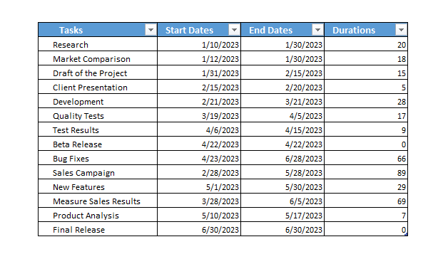
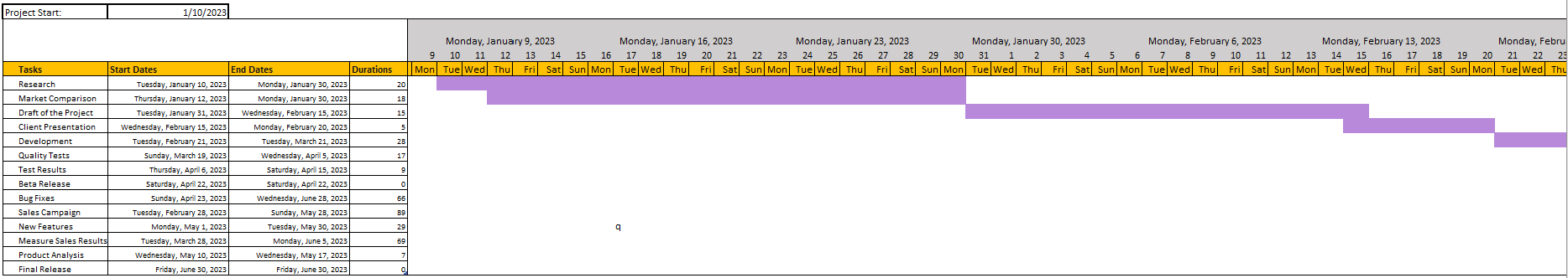
Let’s start by entering the necessary data of the project. These include Tasks, Start Dates, End Dates, and Durations. Then, highlight the Start Dates.
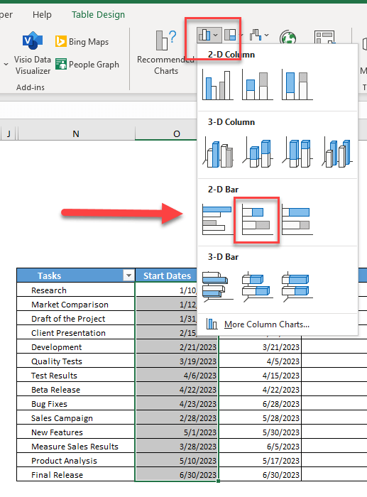
Firstly, click on Insert tab and select Bar in the Charts section. Select the Stacked Bar. So, you can create a basic bar chart.
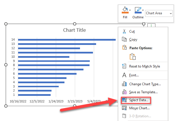
Now that you have the Start Dates set up, you will include the durations. Afterward, right-click on the bar chart created and click on Select Data.
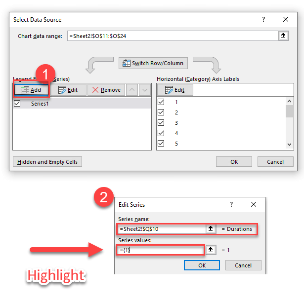
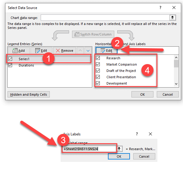
A window will appear titled Select Data Source. On the left, there will be Legend Entries (Series) section which will include your Start Dates. Select the Add button. When the Edit Series window appears, click the header cell. Then, select the data located in the Duration column. To emphasize, do not include the header cell.
Next, right-click on the chart and choose Select Data again. Select the Start Date in the Legend Entries section. Then, click the Edit button located in the Horizontal Axis Labels. On the Axis Labels window, select the Tasks column as you selected the Durations column and click OK to close all the windows.
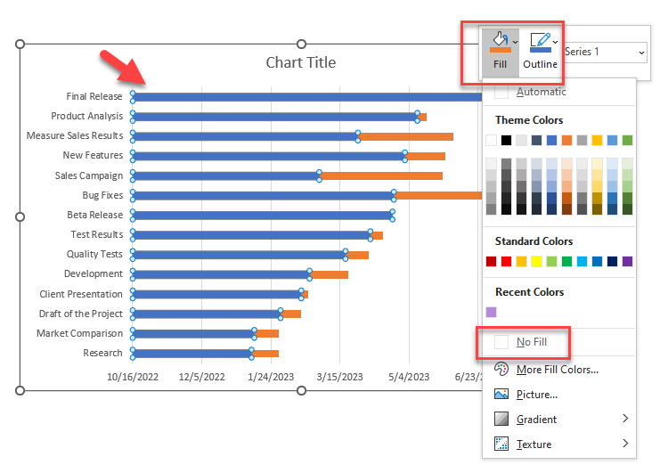
Later, to turn this simple bar chart into a Gantt chart, select all the blue bars, right-click on them and choose Format Data Series. On the Fill section (on the left), select No Fill. And then, on the Border Color section, select No Line.
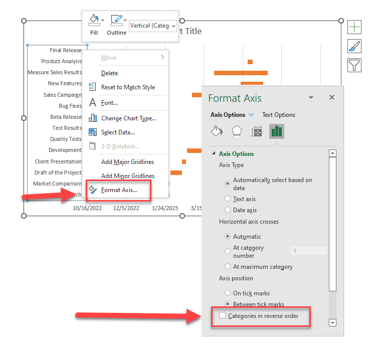
Lastly, click on the tasks on the left side of the chart and select Format Axis. On the Axis Options section, click on the box next to ‘Categories in reverse order’.
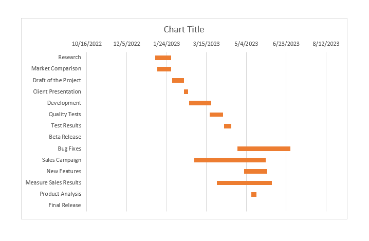
You can choose to customize your Gantt chart further as the size, the color, the format of the bars. This is the end of first method to make a gantt chart in excel.
Method 2: Making a Gantt Chart With Formulas in Excel
Create a table with Tasks, Start Dates, End Dates, and Durations just as in the first method.
In summary, you will make the horizontal axis by writing the dates on the cells in this method.
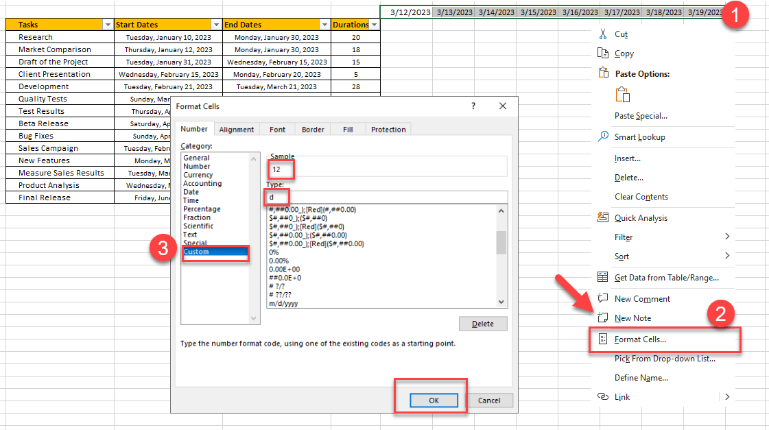
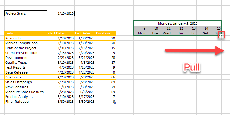
Firstly, write the first start date of your tasks on the cell which is above and next to the table. Repeat for the next six days of the first week. Then, to change the format, open the Format Cells menu by right-clicking the selected dates. Select the Custom category on the Number tab and choose “d”.
Next, to show the days of the week, copy the dates, which you have formatted, and paste them into the next row. Format them as “ddd” by following the same steps. Your first week in the y axis is ready. You can select the dates for excel gantt chart and pull from the edge of the selection to create the next weeks.
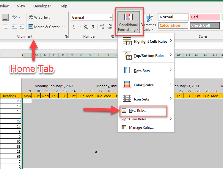
Now, we’ll use Conditional Formatting. First, select the cells, in which you want to show the duration of the tasks. Then, on the Home tab located in the toolbar, choose Conditional Formatting. Select Pick New Rule.
An empty box will appear for you to enter a formula. The formula is =AND(date>=start,date<=end)
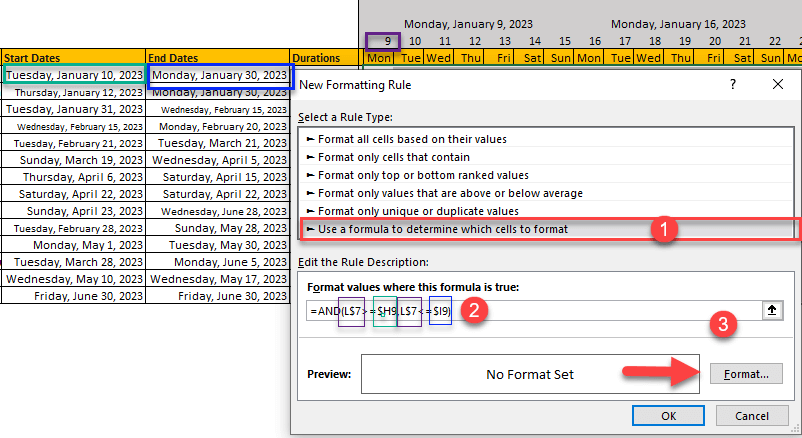
The ‘date’ is the beginning cell of your Gantt chart. Let’s say it is E1.
If your formula returns ‘true’ results, your Excel Gantt chart will look like this:
You can customize the colors. That’s the second method to make a gantt chart in excel.

Method 3: Making a Gantt Chart With Excel Pivot Tables
Firstly, create a table containing the tasks, start dates, and the duration of the tasks. Particularly, you can easily calculate the measure by forming two cells for the start and end dates and using the extraction formula (=A1-A2) in another cell. Insert a pivot table on the Insert tab.
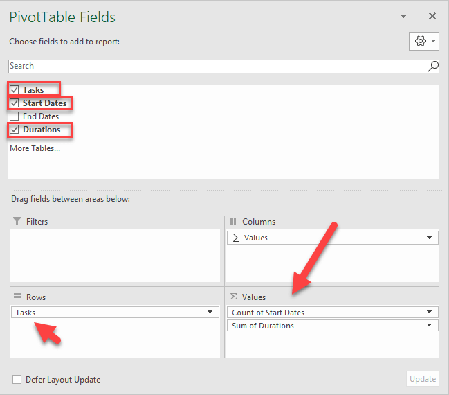
To design your pivot table, click on it. So, a window named “Pivottable Fields” will open. On that window, move Tasks to the Rows category and move the Start Dates and Duration to the Values category.
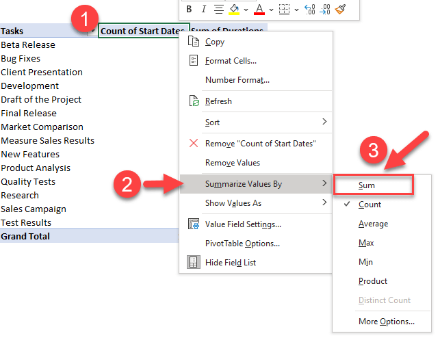
Before proceeding with the chart, you need to change the “Count of Start Dates” to “Sum of Start Dates”. To do it, right-click on the header and select Summarize by Value > Sum. Also, don’t forget to change the numbers to dates by opening the Format Cells menu to make gantt chart in excel.
Now, you can start forming your chart!
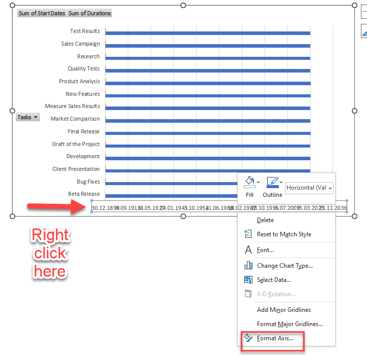
Firstly, go to the Insert tab, select the Chart button and choose the 2-D Bar. After that, you need to adjust the dates on the chart. Right-click on the dates and select Format Axis option on the menu. Here, put a date just before your first date. We put 26th December 2022 as an example. Write it in General format into the Minimum Value box and click OK.
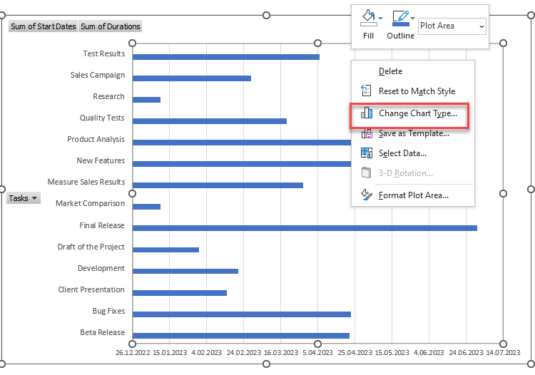
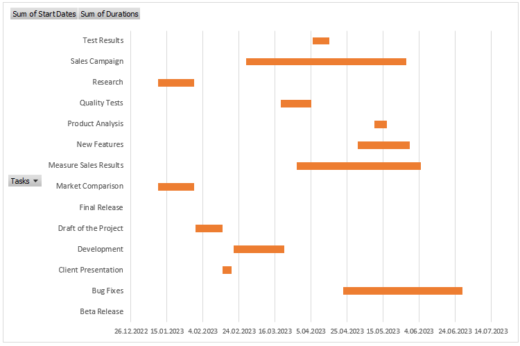
Lastly, change the chart type to make it more like a Gantt Chart. Right-click on the chart, choose Change Chart Type and select the Stacked Bar option on the window. Once the chart has changed, erase the blue bars! That’s the third method to make a gantt chart in excel.
Method 4: Ready-to-use Excel templates
All of these formulas and complicated tasks to follow in order to create a simple Gantt chart can be both time and energy-consuming. Your time is valuable, so here is a Gantt chart that does not make you work and waste your time.
Someka Gantt Chart Maker uses the pivot table technique to form your Gantt charts; however, it has already done all the complicated work! You just need to enter your data and you can create your Gantt chart in 30 seconds!
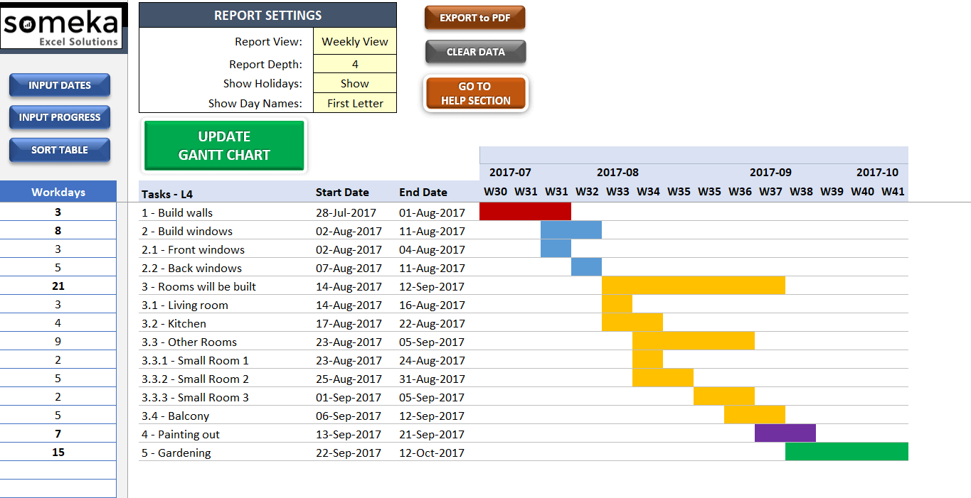
You will have your timelines for projects, task details, milestones, and date information in one spreadsheet and presented in a professional-looking visual design. Do not forget to watch the instructional video to learn more about the template.
There are also additional Subtasks, Task Categories, Holidays, and Off-Days sections in order to give you some extra useful features. And the customizable, colorful adjustments will improve your experience!
If you need an online version of this template, you can download Gantt Chart Google Sheets template. This product also lets you collaborate with collegues.
Final Words:
No matter how you achieve it or how much time you spent on it, it is an inarguable fact that Excel Gantt charts are crucial for project management. But do not forget that Gantt charts are there for saving you time and sorting your projects.
We’ve tried to explain you the basic methods for a gantt chart. You can also watch our tutorial video to see how to make a gantt chart in excel:
If you have something to add or if you find any errors, please contact us.
If you have to spend more time and energy than you will be gaining, there is no point in dwelling on creating your own from scratch. You can always choose to use an easier, more useful, and better-designed option: A third-party ready-to-use template.
Because why should you spend that much amount of time and complicated tools to create a Gantt chart, right?
Recommended Readings:
Related Posts