What is PERT Diagram? How to Plan Better Projects Using PERT Chart?
What Is A PERT Diagram Used For?
The PERT diagram is one of the most useful organizing and managing tools anyone can dive into. No matter in which you are working; no matter how big the size of your company or business is; and regardless of the other programs you are using, the PERT diagram is constantly practical and convenient for your needs.
What Is the PERT Diagram?
Let’s get to know the basics of PERT. The acronym PERT is short for Program Evaluation and Review Technique. You can rarely see the word ‘Project’ used instead of ‘Program’ as well.
The main goal of a PERT diagram is to analyze, review and demonstrate the tasks which are required to complete a project. It is a project management tool which -unsurprisingly- used mostly by project managers. This statistical tool generally focuses on the required time to complete the mentioned tasks and the comparison between each other.

The History of PERT
The method itself was first developed in 1958, notably by the United States Navy. The reason for the creation of this technique came with the development of the UGM-27 Polaris ballistic missiles. These ballistic missiles were submarine launched, therefore, the missions itself and the firing of these missiles needed strong planning, organizing and testing skills. Due to the fact that they can cause enormous harm and damage to the entire world, the complex missions called for never before experienced project management techniques. Thus, the Program Evaluation and Review Technique (PERT) was developed.
Also, even though the Gantt charts were developed nearly 40 years earlier than PERT diagrams, they became popular almost at the same time in the later years of the 1950s. Gantt charts were looked at the more basic version of the PERT. You can find the difference between these two project management techniques in the following chapters below.
It would be useful to mention another project management method which was developed alongside the PERT in 1957. The critical path method (CPM), also known as the critical path analysis (CPA) is an algorithm based technique in order to properly schedule tasks in a project. Even though PERT and CPM function separately and were developed independently from each other. they were used (and have been used still to this day) in conjunction with each other.
Now that you know what the PERT chart exactly is and how it came to be, you might be wondering why you should use it. Let’s take a look at the details on what the PERT charts are used for within projects and by project managers.
Why Should You Use PERT Diagrams?
Fortunately, the answer for this question is easy. Because using the PERT is useful, helpful and effective in order to execute successful projects. You can find reasons how the PERT diagrams make these processes much easier below:
Time (and Project) Management
The PERT diagrams are used to calculate the minimum amount of time you will be needing in order to finish your project. The technique itself examines each of the tasks and their duration. And with the diagrams it presents, it contributes to the analysis of the connections between these tasks. At the end, it gives the result of the estimation of the time you need to complete your project.
Visual Management and Organization
All of this numerical data and details can seem complicated due to the fact that there are not enough visual representations of this information. The PERT diagrams are here to change that. By converting and processing all of the complex numerical data into straightforward visual charts, you are decluttering your project management.
No Project Is ‘Too Complicated’ Anymore
The progress of the employees, the details and inputs of the members of the team for the project and the communication between everyone involved can seem too much to handle. Honestly, it can be. However, no matter whether you are the project manager of the project itself or a member of the team, you will be functioning better and faster with ‘direct information’.
No one wants to deal with ‘too complicated’ details of an already hard to figure out project. The PERT diagrams take these details and create visual and simple illustrations for the project. By feeding the necessary information directly to all of the members of the project, there will not be any project that is ‘too complicated’ for anyone involved.
Improvement of Communication Between Teams
A PERT is a managerial tool as well as an organizational one. Some projects can get the contribution of different teams in various departments. And because of that, some details can get lost during the communication and interaction between these teams of members. Creating PERT diagrams can also detail which department and which members are doing which tasks. It helps to clearly differentiate the particular responsibilities of various departments in a project. The PERT chart not only will organize the tasks of departments but also it will manage the duration of these tasks as well.
The Potential of Possible Projects
Some of the time you might need to plan, organize and manage projects a lot earlier before the execution of them. That means you are creating PERT charts for ‘possible projects’ and looking at the potentials of them. By breaking down the structure and detailing the use of time for the projects, you will be able to see if the project is worth developing. You can say that PERT diagrams help you to examine ‘what if scenarios’.
As you can see it is not that hard to figure out why most of the project managers use the PERT diagrams. It is one of the handiest tools for proper project management and organization. Every project manager should utilize this technique not because it is popular among their colleagues; but because it is one of the best means to success.
Understanding the Terminology
As with every concept, PERT diagrams also have their own terms. You do not have to know every little detail about each of the terms in the glossary. However, if you do not know the name of the terms and their meanings, you will not create a proper PERT diagram. You should at least be familiar with the key terms and their definitions listed below:
Milestone
Milestones are used to indicate the start and the end of an activity or a task included in the project. The term is also known as a PERT event. The beginning of an activity is called ‘a start milestone’ or ‘a predecessor event’. Additionally, the end of a task can be called ‘a finish milestone’ or ‘a successor event’. Both of the milestones can be used to point out more than one task and activity. Due to the fact that it is only an indicator, it does not use any time or resources.
Task
The task itself uses both time and resources. The resources consumed for a task can include human labor, raw or processed materials, physical space and intricate machinery.
The task is the representation of the spending of time, energy and resources for the sake of the project. The task can also be called ‘a PERT activity’. A task cannot be initiated and executed without an established start milestone. A task’s symbol can be an arrow shape in a project, which represents that the task needs to be performed. The symbol for a task table in a PERT chart is a shape similar to a rectangle.
The task table can estimate the beginning and the completion time of the activities, it projects the start and finish dates of the activities and includes the information of the task owner.
Critical Path
A critical path shows the ‘road’ for the project. It is the pathway the projects follow from the first PERT event to the last one to complete the whole given job. The critical path also includes the duration of all your tasks in the project which can be added up in order to show the total period of time. It charts the longest possible pathway from the start to the finish.
Some projects can consist of multiple critical paths which calculate the individual duration of all of the tasks. Thus, these critical paths can also estimate the overall duration of the whole project. The critical path is determined by the Critical Path Method or as known as CPM which was mentioned above in the previous chapters.
Slack
If any of the tasks are delayed, then the duration of the critical path is delayed as well. However, if a task is delayed and it does not cause any delays for the overall duration of the project, it is called a slack. You can think of an individual delay for an individual task. This slack does not affect (in terms of time) any of the other tasks which are included in it or the project itself.
The term is also known as float.
Critical (Path) Activity
If there is no slack for any of the tasks in the critical path of the project, that activity is called critical path activity.
Lead Time
This duration of time shows you how much you should spend (in terms of time) in order to complete a task or an activity. Lead time indicates the ‘ideal’ duration for the completion of a task without the delay or an impact for the subsequent tasks.
Lag Time
Lag time is the minimum amount of time between the two tasks. The lag time shows how early a task can follow another one.
Optimistic Time
Optimistic time is the most minimal possible time necessary to accomplish a task, an activity or a critical path. Unexpected events, sudden tragedies and disasters that can radically alter the optimistic time are not taken into account.
Pessimistic Time
It is the highest amount of time required to complete a task, an activity or a path. Again, similar to the optimistic time, pessimistic time also does not include unexpected and negatively impactful events. You can think of it as ‘the worst possible scenario’.
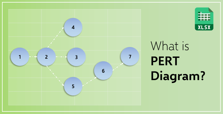
Nodes
Nodes are only symbols to visually represent events and milestones. In a PERT chart, nodes can be shaped as a rectangle or a circle depending on the preference of the project manager.
Vectors
Vectors are symbols for the duration of the tasks. They can be solid or dotted arrows depending on the type of activity or the task.
Related Reading: UML Diagram Types Guide: Learn More About Tools & Examples!
Pros and Cons of the PERT Diagram
There are, undoubtedly, more advantages to the PERT than they are disadvantages. But it is still important to know both of them in order to decide on whether you want to use this technique for your projects or not.
The Advantages of PERT Diagrams
- A PERT diagram clarifies how much you will have to spend on individual tasks and the project as a whole.
- It presents detailed structures and breakdowns of the project’s sequence.
- It improves your managerial skills.
- It eases the project management processes.
- It creates (or builds up on) the communication between you and your employees, coworkers, supervisors, etc.
- It does not only help you to manage your and the project’s time but also assists you on how you can manage your resources as well.
- This proper project management leads to the diminishing numbers of every type of waste.
- It analyzes the time, budget and the constraints of your projects and each of the activities.
- It also makes the contribution process among different departments to the same project available and much easier.
- As it was mentioned in the previous chapters above, the potential of the projects can be calculated as in ‘what if’ analyses.
- A PERT diagram not only improves your decision making skills as a project manager and also, it lets the project to be presented in a much simpler and direct way.
- Last but not least, PERT charts also grow the trust between the business and the company. The potential of high customer satisfaction becomes much more real.
The Disadvantages of PERT Diagrams
- Even though a lot of calculations are made for each of the tasks and the overall duration for the entire project, they are all based on estimations and guesses. That means a person who is not an expert with the technique can come up with inaccurate results.
- The benefit of a PERT diagram is saving time; but actually, it takes a considerable amount of time and energy to gather all the information and to create a PERT diagram. It takes time to save time. It is an important aspect of the whole process to consider.
- As with the calculations, if a person who is not familiar with the PERT concept applies the method to the data she or he is given, that can have dangerous consequences. Let’s say that person with inaccurate calculations for the project has developed a PERT diagram. This chart will be presented to those who are in charge to confirm or deny the start of the project. If the diagram is wrong and confuses people such as supervisors, project managers and shareholders, then the project would be denied.
- The whole concept relies on the fact that ‘a task must end in order to start a new task’. As you know, things do not occur like that in real life. A lot of tasks are, in fact, done simultaneously at the same time by same or different workers.
How Are PERT Charts Used in Project Management?
A PERT diagram is usually used before a project in order to clearly identify the time, energy and labor needed for the project. These early steps can also be considered the first part of the project or in some cases as ‘pre-production’.
Project management handles the possibility of the risks which should be taken into consideration. Calculating the duration of the project, figuring out how and when to complete every task will create an applicable schedule for the project. Additionally, project managers not only deal with time but also employees, supervisors, independent communication and other personal or business responsibilities in general. That is why project management for each of the projects is crucial to decide on whether to continue with it or not.
One of the other tools project managers use for management is, as it was mentioned in this blog post, the Gantt chart. Gantt charts can be utilized with PERT diagrams as well; however, their functionality actually differ from each other. Let’s look at the different capabilities of these two techniques.
PERT Charts vs Gantt Charts
Both of these types of charts allow the user to present their project in a visual way. The user, let’s say the project manager, can lay out the tasks and activities for the project in both of these tools. They gather the data and present it in their own unique way. And that is the exact difference they acquire: On how they present the data of the whole project.
Gantt Charts
Gantt charts can be considered as bar charts as well. The timeline of all the tasks, activities and the project as a whole is presented in a linear manner. While the Y axis of the chart presents the individual tasks of the project, the X axis represents time. Therefore, making the timeline of the Gantt chart chronological.
While maintaining efficient time management, the project manager can also organize and customize the tasks, the people who are responsible for the mentioned tasks and the details.
Compared to PERT charts, Gantt charts are mostly used after the process has started. It is used for moderation and monitoring in order to achieve a level of transparency for the employees and supervisors to clearly follow the progress. All of the tasks, the details and the planned schedules for the whole project.
Whether you are the general manager of a company, the project manager of a sole project or a team member, you will need a Gantt chart to keep track. In addition to tracking the progress of individual projects, you are able to see the big picture in a clear way. And if you do not know where to start for creating a Gantt chart, start with an Excel template!
Someka’s Excel Gantt Chart Maker is specifically designed for members of a project regardless of their title. This template has the perfect professional approach to the visualization for your projects. While it saves you time with the basic yet detailed interface, it also allows you to customize almost every feature in it! Only with a click of a button, you can create your project’s own Gantt chart in a matter of minutes. It is an exceptionally useful tool for everyone involved in project management. We have also a Google Sheets Gantt Chart Template in our portfolio.
How to Make a PERT Diagram in Microsoft Excel?
The process of creating a PERT chart from scratch can be a complicated and time consuming task. That is why in this chapter, you will be informed about the step by step process of creating a simple PERT diagram in the most appropriate program: Microsoft Excel.
‘The beginner’s guide’ to PERT diagrams goes through creating the nodes of the chart with text boxes or basic shapes in Excel. But what steps should you follow?
Step 1: Determine all the milestones and tasks of the project
For example, the project you are working on is the visual aspect of a building. You need someone to sketch the building, detail all the crucial parts of it to function properly and then transfer these to the digital files.
Your milestones can be:
- The start date of the project
- The completion of a basic sketch
- The adjustments and notes on the sketch
- The first draft of the drawing
- The details added
- The final notes
- The final illustration completed
Your tasks can be:
- Hiring or assigning sketch artists
- The outline of the project is given to the artists
- Their basic sketches are delivered
- The notes are given
- The design is changed or adjusted accordingly
- The final drawing is delivered
- The artists are paid
Step 2: Figure out the connection between the tasks
Some tasks can be independent from others and some tasks can be dependent on each other. In terms of the example above, the payment for the artists who worked on the project and delivery of the sketches should follow one another. But the payment must be approved by the accounting department. The communication should be noted on these tasks because it can delay, affect and alter the project’s progress.
Step 3: Create the necessary shapes
Now it is time for you to create the circles and rectangles in Excel. It can be a little complicated at first, so that is why it can be helpful to put your start milestone and finish milestone first. If you know where to start and where to finish, you can figure out the tasks and milestones between a lot easier and faster.
Step 4: Calculate the time
After you have entered the tasks you want to complete, you need to estimate the duration of each of the activities.
Step 5: Find your project’s critical path
The critical path, as it was detailed in previous chapters, is the pathway which will take the most time. Your (somewhat) exaggerated plan to complete your project. It can be looked at as an unnecessary step; however, as they say, “plan for the best, prepare for the worst.” So, there is no harm for you to calculate the longest possible time it will take for you to conclude your project.
You can use Someka’s PERT Chart Generator to create automatic PERT charts in seconds.
Also, this template will be a perfect alternative to Visio for Mac users. So, if you’re using Mac, you can create Visio pert chart diagrams with this template. Please check our article to learn more about Visio alternatives for Mac.
If you are still not sure how to create a PERT diagram, make a flowchart instead! They are nearly identical and very similar in terms of visuals. You tried to create a PERT diagram in Excel and it seemed ugly or insufficient, try Someka’s Flowchart Maker!
It has all the shapes you will be needing in a PERT chart and it also comes with highly customizable features as well. Your project management will flourish. It will be a professional-looking PERT diagram for you to use in presentations, you can even easily print it! If you think Excel is not enough for your project management needs, the chart created by the template is going to be the tool you need. You can access well designed and visually good looking charts for the management and organization of your projects.
Related Posts