What is a Pareto Distribution? Here is an Eye-Opening Guide to Pareto Charts!
Here’s a pareto chart article to discover 80/20 rule with details. You’ll find explanations, examples and pro tips about pareto principles here.
But before we start, let’s see a quick tutorial of Pareto Chart Google Sheets Template by Someka:
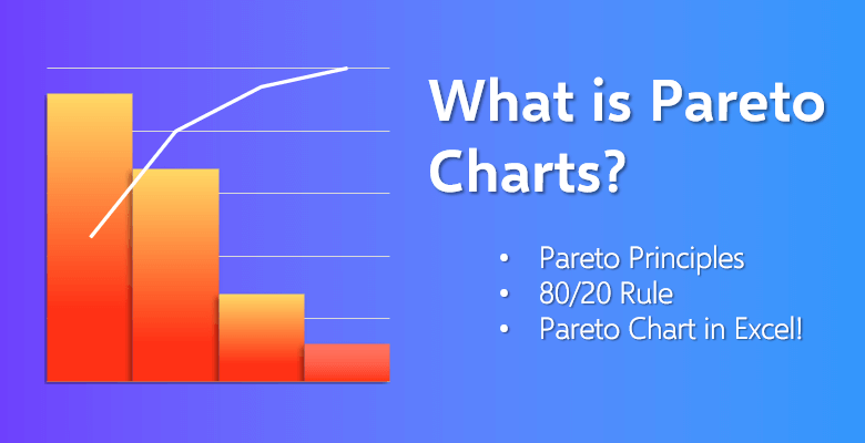
What is Pareto Chart?
A Pareto chart is a graph that first, shows the key defects, errors or problems of the situation. It exhibits their number of occurrences or in other words their frequency. Then, it calculates the impact of every problem to the situation.
The collective impact of all the defects is shown as the cumulative percentage in the chart. The graph is also sometimes called a sorted diagram or in some cases a Pareto diagram as well.
The chart consists of a bar graph and a line graph:
The combination of these two create the chart in question. Each of the bars in the graph represent a defect, a problem encountered or an error. The height of the bar shows the unit of measure which is often the number of occurrences of the defect or sometimes the cost of the problem.
The bars in the graph should be sorted from the greatest number of occurrences to the least.
Due to the fact that they go from tallest to shortest, it becomes much easier to realize which problems are more frequent and in ne ed for more attention without detailly analyzing the graph.
The line graph shows the total impact of the defects to the situation:
That means the sum of all percentages regarding the defects in the bar graph. The line serves as the indicator, if solved, how much of the percentage of these defects can be eliminated.
If the defects are removed from the graph, that means the collective impact of these mentioned defects would be decreasing as well. Also, the line shows you which defects you should prioritize on solving. The line points that this defect should be solved first in order to get the most overall improvement.
*PRO TIP: In any Pareto chart in regards to any field, if the line in the chart is perpendicular or instantly becomes steep, then it means the problems in the situation will have more impactful consequences.

Thus, these defects can become a burden if not detected. And when these defects are detected and put into the graph, they need to be solved, if not, their negative effect becomes larger. The cumulative negative effect of the defects can be problematic in whatever field you are creating your chart for.
Keep in mind that the Pareto chart is only a tool which assesses quality and the main hurtful factors of your situation. Its main purpose is to help analyze the issues and determine which problem to prioritize.
You should not expect a Pareto chart to solve the defects or offer resolution for the problems. Its aim is to show, not solve.
Vilfredo Federico Damaso Pareto:
The main idea behind the chart is the ‘Pareto principle’ or known as the 80/20 rule. You might be wondering why the chart and also the principle which is based on called ‘Pareto’ and also, what does ‘80/20’ mean?
The man who first noted the 80/20 rule is Vilfredo Federico Damaso Pareto. The man behind this concept Pareto was an Italian engineer, sociologist, and an economist. He made significant progressions in regards to income distribution and in the analysis of individuals’ choices.
The 80/20 Rule:
The creation of the 80/20 rule (or the Pareto principle) came about when Vilfredo Pareto realized a significant distribution difference in terms of land.
In the late 19th century, Pareto gathered up and processed the data to find that 80% of the property and land in Italy was owned by the 20% of the population. This revelation was also utilized in regards to income gap, taxation and wealth as well.
However, no matter the field or the area this principle was used in, the percentage of it never changed. The small number of the sum had the majority of the impact in every situation. These 80 to 20 distinctions resulted in Pareto naming the rule itself, ‘80/20’.
Later, when management consultant Joseph M. Juran wanted to expand this concept and realize it as a principle, he suggested Pareto’s name for it.
The Pareto Principles
Pareto Principle:
As it is mentioned above, a small number of significant defects (20%) make up the majority of the overall problem (80%).
In other words, the few but important problems have the most impact overall.
This principle can be also developed in distribution of income and wealth among the population contexts as well.
Pareto principle can be applied in a wide range of areas such as manufacturing, management, and human resources. Also, other than business ventures, it can be applied to personal issues and on a personal level.
Also, unlike other principles, it is not a law or a requirement. It is simply an observation of a situation. Though it is accepted, widely recognized and broadly applied in different fields and areas, it does not apply to every problem, scenario or situation.
In the future, if you remember the name 80/20 rule, however, you are confused about what it means, remember this simple explanation: Life is not fair. The most things in life are not distributed equally.
Pareto Efficiency:
Pareto efficiency or often known as Pareto optimality states that in any situation whatsoever, it is impossible to make one party better without making the other party worse.
It states that not every situation needs to be fair or equal and even it cannot be.
For example, imagine you and your friend are hungry and you have only an apple to eat. And imagine that you do not like apples so you do not want to eat it.
However, your friend loves apples and he or she is the one to eat the apple and suppresses his or her hunger. At the end, you did not eat anything and you are still hungry. On the other hand, your friend ate the apple and is now not feeling that hungry. Your friend feels better and you feel worse… and this is the Pareto efficiency.
The Pareto Principle Examples
This principle is used in almost every field even if you do not notice it! Let’s start with the most obvious are: Economics.
Economics:
Pareto himself first came about the concept in the field of economics. The 80% of the land belongs to the 20% of the population observation is related to wealth. Pareto noted the idea at his university in 1896. And nearly one hundred years later, if we look at the 1992 United Nations Development Program Report, we see exactly what Pareto proposed nearly a century ago!
The report shows that the distribution of global income is – unsurprisingly- not even. The data shows that the richest 20% of the population controls the 82.70% of the income in the entire world.
Thus, proving the 80/20 rule.
The principle also can be applied to taxation as well. In the United States, the top wealthiest 20% of the population have paid 80% of the Federal income tax.
Computer Science:
One of the other areas this principle and the 80/20 rule can be seen applied to is computer science.
The optimization efforts in Microsoft show that by fixing the 20% of the most reported software bugs, 80% of the software errors and crashes would be eliminated.
Also, in computing, coding uses this principle as well. It is stated that the hardest 20% of the code takes about 80% of the time.
Sports:
Sports is one of the areas that this principle is used and is tested at the moment.
The principle applies to athletic training in that 20% of the physical exercises and habits of an athlete have 80% of the impact of the performance.
However, it should be noted that the 80/20 rule has yet to be scientifically proven in regards to athletic training.
Health and Safety:
In the field of health and safety, experts use the 80/20 rule to underline the importance of hazard prioritization. It is assumed that 20% of the hazards take about 80% of the injuries occurred.
Marketing:
Also, in marketing and social media management, it can be seen that 20% of the posts of any page or an account generate 80% of the traffic. Again, the 80/20 rule can be seen.
Crime Statistics:
The principle can also be applied to crime statistics as well. Of course, the rate and the numbers vary country to country and region to region.
However, average statistics show that 80% of the crimes committed in a country are committed by the 20% of the criminals.
Applying the 80/20 Rule to Everything!
As you can see the many different examples above in the previous chapters, the 80/20 rule and its principle can be applied to nearly every field and into almost anything!
However, if you want to apply this rule to your life, always keep in mind, this rule is merely an observation of your situation.
Step 1: Identify your goals
Think of all the things that will give you 80% of your total happiness while only achieving 20% of your goals. It can seem a little hard to think, detect and visualize but it is actually not. You can make a list on what you want in your life the most and then select the top 20%.
The idea can overwhelm you because you would want to list everything you want in life and perhaps force yourself to choose. Each of your dreams and aims need time, care and effort in order to achieve it, that is why it is important you keep them to 2-3 goals; or in other words keep it only 20%.
Step 2: Realizing your path
Think of the paths you go through for achieving each of your goals. What is the effort-reward rate of those paths? Generally, every goal has four possible paths in terms of effort-reward percentage.
These are:
- Low effort -> low reward
- High effort -> low reward
- High effort -> high reward
- Low effort -> high reward
If you want to apply the 80/20 rule in your life, you should choose the low effort -> high reward path. The simplest path to achieve the maximum result is the low effort which is 20% and high reward which is 80% path. With this rule (and this path), you would achieve the best return on investment (ROI) as well.
Learn from others’ experience and also your past errors. Research and find what others have done and what kind of path they chose to achieve goals similar to yours.
If you can, reach and talk to them. However, do not forget, every path is different to everyone. So, in the end, you would be mapping out and creating your own 80/20 path.
Step 3: Determine your actions
Do not rush yourself into taking actions. First, identify them.
Study all the actions you can take and follow the path on where they lead you. You can ask yourself: What are some key actions I should take that will make a huge impact in the big picture?
When you answer, what are some actions I must take to achieve the 80% happiness, then, you would be ready to take those actions.
Step 4: Take action
After identifying which actions to take, take them.
However, in the meantime, be aware of your research. If the actions you took did not respond well (or well enough), you can always experiment and try new and different strategies. You can open your mind and take others’ advice on different things.
You can learn from your own trials and errors.
Advantages & Disadvantages of a Pareto Chart
As with everything, creating a Pareto chart also has its advantages and disadvantages. To identify the most significant factors that you should focus on, you can create your own chart in Microsoft Excel. In Excel, Pareto charts can be considered a type of sorted histogram that contains both vertical bars and a horizontal line. The advantages of creating your Pareto chart are that:
- It improves the decision making process in any situation it is used.
- Highlights the major defects of any process.
- Increases operational and organizational efficiency.
- Based on a well known principle, thus, it is used regularly in every field.
- Helps to identify the significant problems; therefore, it becomes helpful in order to solve them as well.
- Improves problem solving skills.
- Helps to sort out important elements of any situation.
- With the 80/20 rule, it helps you to focus on the crucial factors of the process.
Its disadvantages are that:
- It does not provide the main cause of the problems.
- Does not get into the deep roots of the situations.
- It is merely an observation, not a solution to any of the defects, errors or problems.
- It might require additional information and data in order to be used to calculate standard deviation.
- Can not predict any outcomes of any possible action.
- Can not compute the outside elements and factors which can cause or change the problems put in the Pareto chart.
- The 80/20 is not always true. The principle and thus the chart, does not have to be resulted in 100% either.
How to Create Your Own Pareto Chart:
As it is mentioned in previous chapters, using Microsoft Excel is the best way to create your Pareto chart. And the reason for that is Excel already has a built-in Pareto chart type for you to use. All you need to gather is a list of your items and their count.
Now, these items can range between issues and factors to categories and defects. These items will be put in one column. And in another column, you would put the number (or the frequency) of these items. Let’s go step by step on how to create your own chart in Excel:
Step 1: Collect the raw data
This means with research, trial and error and/or through interviews gather your information. For example, let’s imagine you are managing a restaurant and you want to create a Pareto chart on your employees’ mistakes or bad behavior. You would be creating two columns such as the one you are seeing below:
| Complaint | Count |
| Playing with phone on the job | 54 |
| Wrong order | 41 |
| Bad attitude towards customer | 24 |
| Not doing any side work | 8 |
Step 2: Insert Histogram
After you put in the information, select these two columns. Above in the Insert tab, you would see the Charts group. Click the Histogram symbol.

Step 3: Pareto Chart
You would see the Histogram and the Box and Whisker types of charts. Click the Pareto chart in the Histogram section. Your Pareto chart will be created.
Additional steps: You can enter your chart title. Also, you can click the + symbol on the left and select which chart elements you want to include on your Pareto chart and which ones you want to deselect.
Alternative step: You can also use the All Charts tab in the Recommended Charts section to create your Pareto chart.
After you put in your raw data, just click the Insert button and select Recommended Charts.
When your Recommended Charts appear, open the All Charts tab.
Pareto chart selection will be in front of you.
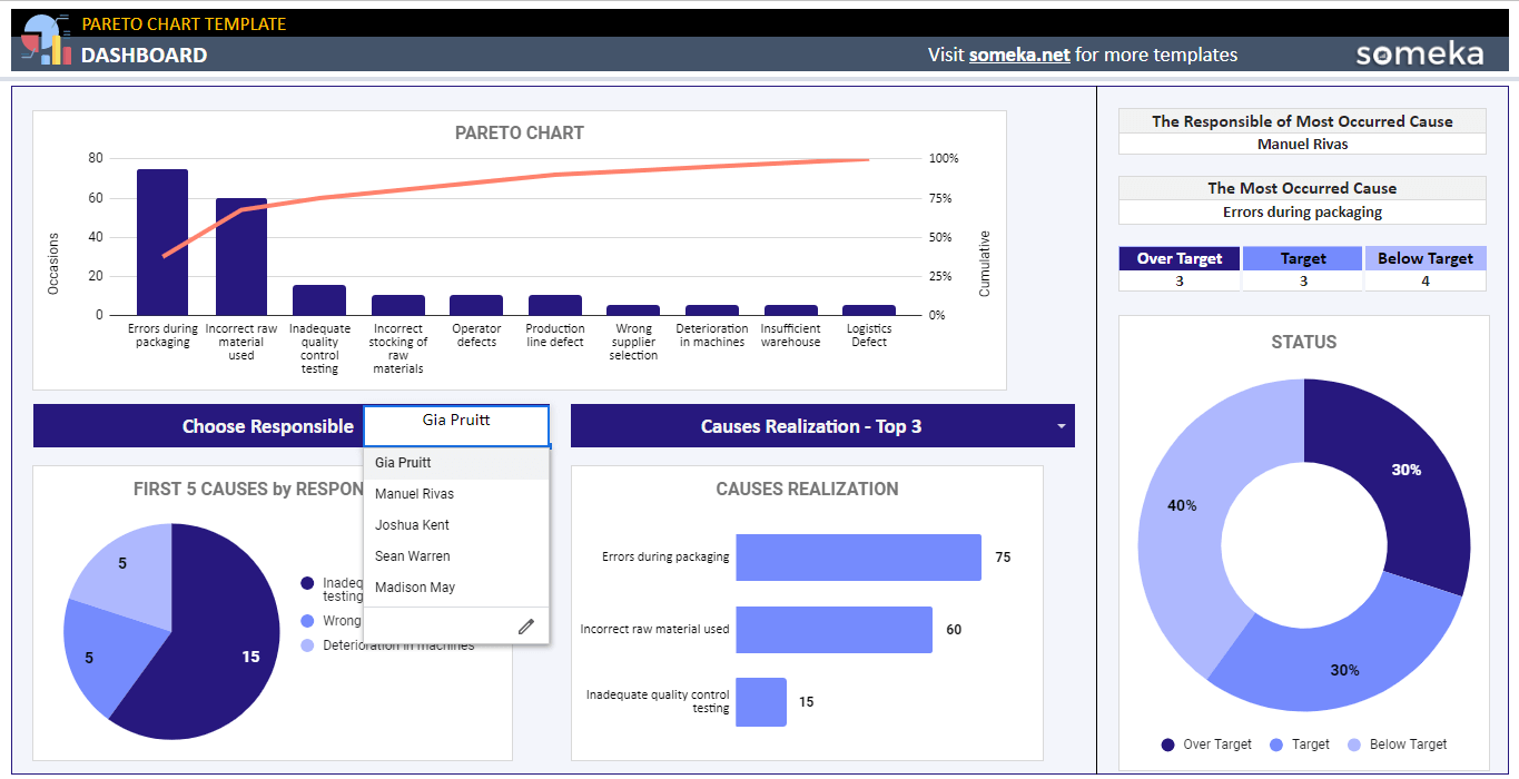
Excel Templates to Help You Create Your Pareto Chart:
Of course, collecting data, gathering them up and then processing the information can take a lot of time and hard work. However, it does not have to be like that! If you use Someka’s Excel templates, your process of creating your own chart will take much less and the work would be much easier for you.
Pareto Chart Generator:
Someka provides you ready-to-use templates to draw your Pareto diagram in seconds. All you need to do is input your data and see how your pareto distribution seems. You can download Pareto Chart Excel Template, or Pareto Chart Google Sheets Template to get a quick Pareto diagram maker.
Sales Dashboard:
Let’s say, you want to detail your customer and/or product service. Also, you want to include region details with sales trends, distribution analyses and the profitability of your business. Someka’s Sales Dashboard Template provides you everything you need in professional sales management. It is a ‘must-have’ tool for every management department.
Venn Diagram:
Perhaps, you want to create Venn diagrams in different shapes and sizes in order to clearly see what intersects or crosses over each other. Someka has a template for that as well and more importantly, it is free! The Venn Diagram Template has eight different diagram models for you to choose. Also, it has a lot of customization features as well.
Automatic Flowchart Maker:
If you want to dive deep into the information and the metrics of your business or company, you can also use the help of flowcharts as well. Someka offers the Automatic Flowchart Maker which is a detailed flowchart generator with only a click of a button. It does not use the basic ‘drag and drop’ method such as other online flowchart programs and software. It also comes with a ton of customizable features as well.
Automatic Org Chart Maker:
Do you remember the ‘employee behavior example’ on creating your Pareto chart in the previous chapter? Imagine you created an employee list on Microsoft Excel. However, only the names and no other information confuses you. You need photos of your employees, the information on who they report to and etc. Someka’s Automatic Org Chart Maker takes your Excel sheet of employees and turns into a practical database. It is cheaper compared to other org chart tools and software and also, it comes with the unique ‘Photo Upload’ and additional ‘Sub-Layout’ features as well.
Conclusion
Creating a Pareto chart or multiple charts will give you leverage on whatever concept you are creating the chart for. The 80/20 rule alone has a huge impact on the careers of successful business people and conglomerates.
Whether it is business, retail, manufacturing, societal categories or personal development, the Pareto principle will be always important in order to improve. Acknowledging the 80/20 rule, gathering and processing raw data and then, creating a Pareto chart is one of the most powerful tools and ways to climb that ladder called ‘success’.
Related Posts