How to Make a Histogram Chart in Excel?
Learn how to make a histogram chart in Excel for your projects and work with this tutorial!
Table of Contents:
- What is a Histogram Chart?
- What is the difference between a histogram chart and a bar chart?
- When to Use Histogram Charts?
- How to Make a Histogram Chart in Excel?

What is a Histogram Chart?
A histogram is a chart type that displays the frequency of specific values distributed in range groups. It visualizes the frequency distribution by arranging the data values into bins and then presenting them as separate columns.
Histogram charts group the data value bins along the x-axis of the chart, while it displays the distribution frequency along the y-axis (the amount or the percentage of the variable amongst others).
What is the difference between a histogram chart and a bar chart?

Histograms appear like bar charts, because they both use segmented columns, so they easily confuse each other. However, there are concrete differences between a histogram and a bar chart. As we described above, a histogram presents the frequency distribution of data, while a bar chart compares categorical data within columns that are proportional to their values.
Histograms can only use numeric data as variables while bar charts can display categorical data on the x-axis. That’s why if your variables are not numerical, a bar chart is a better fit to visualize your data. That’s also why the width of the columns doesn’t represent anything in bar charts.
There are no gaps between bins on a histogram. As a result, if you have a continuous data set, a histogram would be more helpful to you.
When to Use Histogram Charts?

It is important to know how to make a histogram chart in excel. Histogram charts may seem like simple visuals, but they have many uses and applications for analysts and statisticians. Histogram charts are generally used to examine the statistical characteristics of a data set. What are the more specific applications of histogram charts?
- Visualizing the distribution pattern of a data set:
When values are displayed in a histogram chart, they form a shape that can look symmetrical, uniform, bimodal, or asymmetrical. This makes the viewer understand more about the variability of the data. The shape of the histogram can also give information about the missing data or the wrong construction of the histogram.
- Detecting Multimodal Distributions
Detecting a multimodal distribution is very complicated without visualizing the data with a histogram. A histogram can smoothly show a multimodal distribution with the aid of its column feature.
- Determining Deviations
If your variables contain some outlier data within them, a histogram chart facilitates the process of determining them. Their bin is shown isolated from the others. Thus, it is easier to detect an abnormality in the data.

How to Make a Histogram Chart in Excel?
We will try to explain how to make a histogram in Excel step by step with different methods.
Method 1: Making a Histogram with Charts
Creating a histogram in Excel is rather easy thanks to the charts feature of Microsoft Excel. To make a histogram chart in Excel, first, you need to prepare your data set. We have our data set that shows the cores of students in a university course.
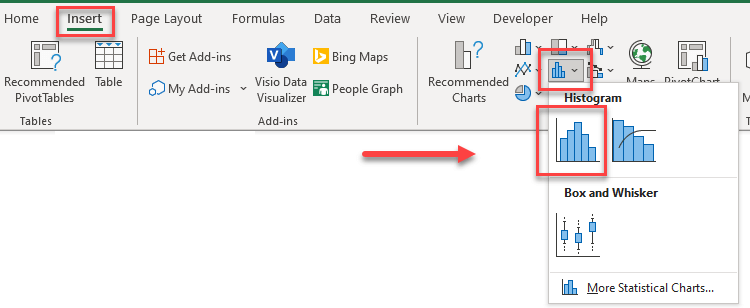
After preparing your data set, you can simply highlight the data and choose the Histogram Charts section on the Insert tab.
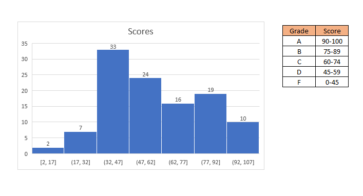
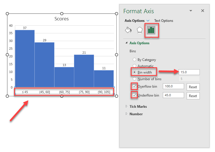
After that, the histogram chart will show up on the spreadsheet. Although, Excel determines the ranges automatically. Because our ranges don’t fit with the ones that Excel estimated, we must change the ranges manually. To adjust the range, click on the x-axis on the chart and choose the “Bin width” button on the window. Then, write your preferred range. If you want to collect values over or under a certain number, choose the Overflow/Underflow options.
Finally, you customize your chart’s color and style in the Chart Design section on the Excel ribbon. Your histogram chart is ready.
Method 2: Making a Histogram with the Data Analysis ToolPak Add-in
Analysis ToolPak is an Add-in of Microsoft Excel that is useful for data analysis and visualizations. To make a histogram chart in Excel with Analysis ToolPak, first, you must install the add-in.
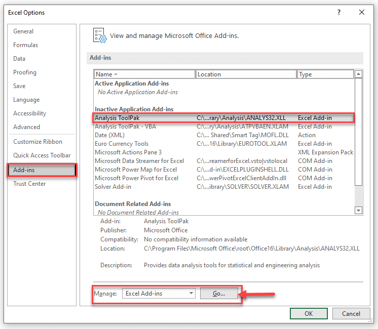
To install it, go to File and select Options at the bottom of the page. On the opening window, choose Add-ins, select the Analysis ToolPak, and click on “Go” as in the image below. A new window named Add-ins will be opened. Choose only Analysis Toolpak and click OK.
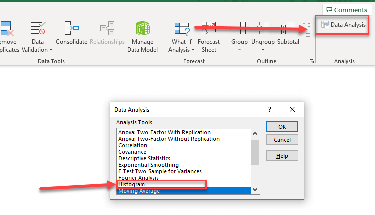
After that, you can choose the Data Analysis feature on the “Data” tab on the Excel ribbon.
Then, you must also set bin ranges just before continuing the process. To set the bin ranges, you must indicate where the bins will start. Write these range start points as a separate list.
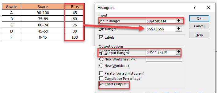
Next, choose Data Analysis and select the Histogram option on the menu. For the Input Range, select the data set range that you want to display. For the bin range, select the interval list. Finally, for Output Range, select the place you want to see the histogram chart show up. After clicking OK, your histogram will show up.
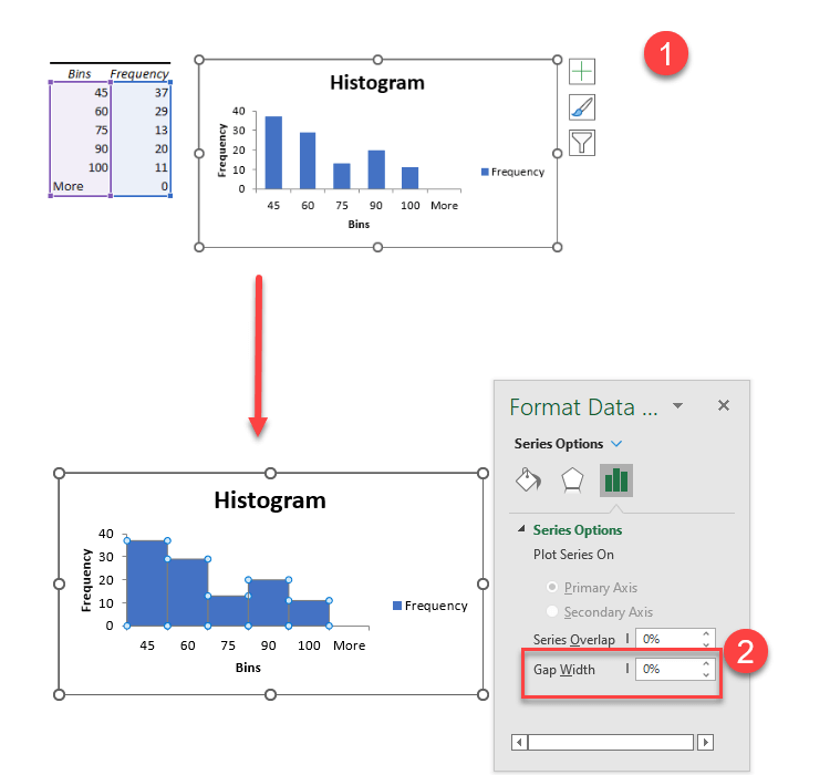
However, the bins of the histogram will have gaps between each other. To format it, right-click on any of the bins, choose Format Data Series, and set the Gap Width to zero. You can also format the design of the histogram chart if you want to.
Method 3: Ready-to-Use Excel Templates
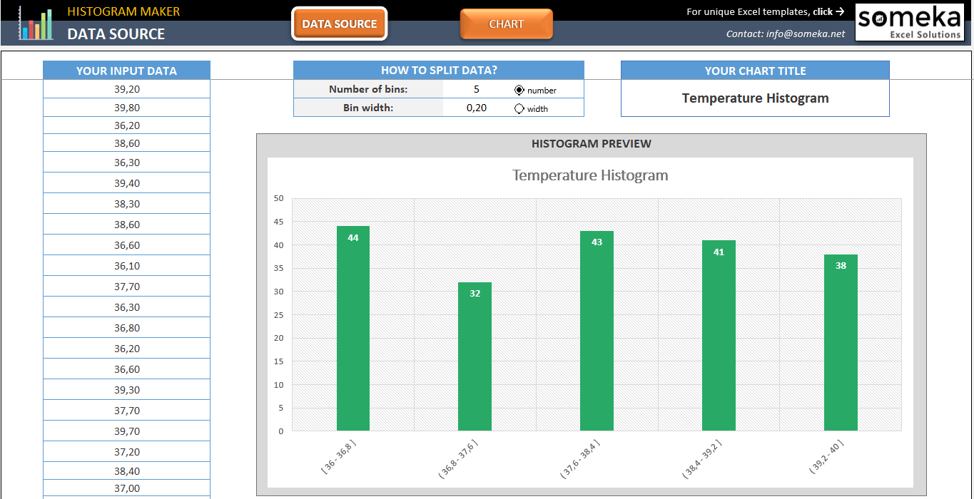
Making histogram charts in Excel may not be effortless or fast, but there are alternatives. If you want to make a histogram chart in Excel without any struggles and Add-ins, you can try to use Someka Histogram Maker Excel Template!
All you need to do is to put your data set in the data source section and create your custom histogram. You can smoothly customize the colors and style of your histogram and copy/paste it for your projects.
If you also need a Pareto Chart, then you can download Someka Pareto Chart Excel Template to create your diagram in seconds after inputting your data. You can also check out Pareto Chart Google Sheets Template if you prefer an online version.
Watch our product video to learn more about our Histogram Maker Excel Template.
You can also watch our tutorial video to learn how to make a histogram in Excel.

Consequently, we have tried to explain how to make a histogram in Excel step by step with different methods. If you have something to add or if you find any errors, please contact us.
Recommended Readings:
What is a Pareto Distribution?
How to Create a Treemap in Excel?
Related Posts