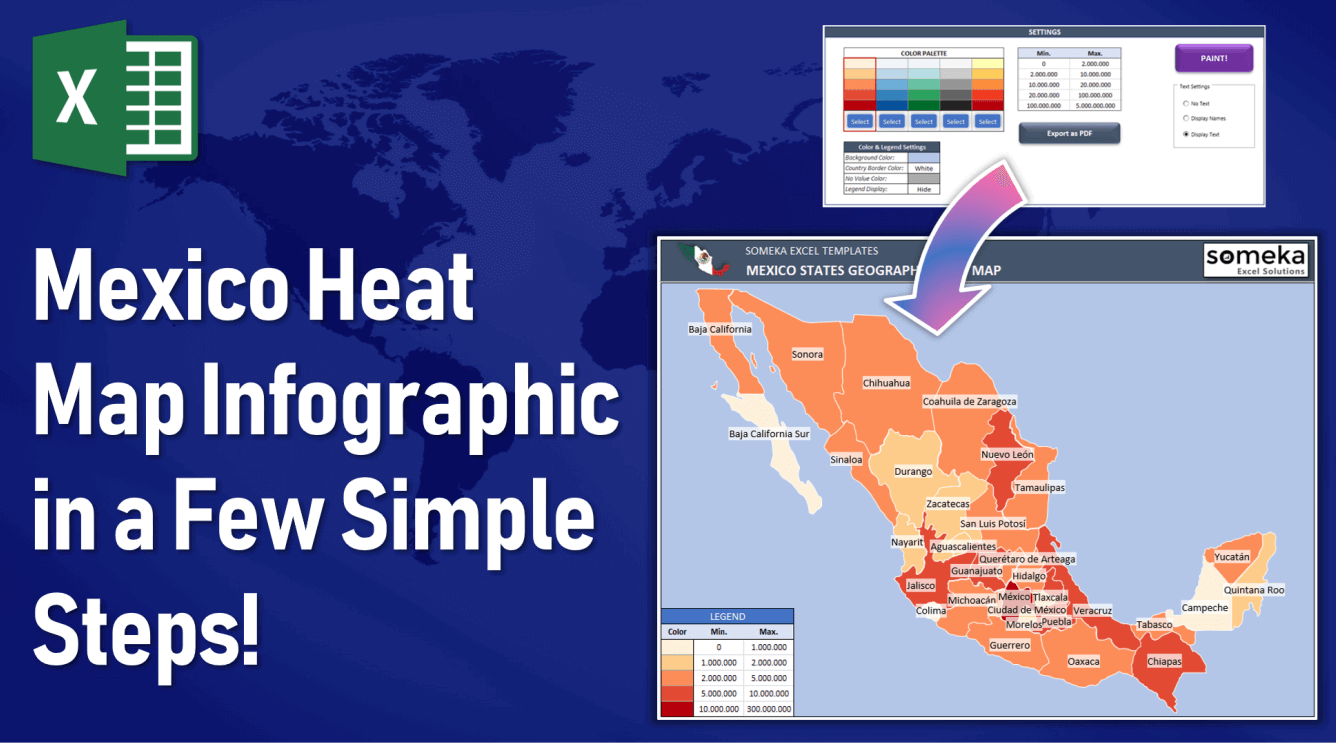
Mexico Heat Map Infographic in a Few Simple Steps!
Heatmaps are getting more and more important in today’s modern presentation techniques. They’re increasingly popular to visualize large volumes of data. That’s why most companies started to use especially geographic heat maps for seeing all these statistics and data effectively on maps.
From time to time, we receive customization requests for our Heat Map Generators. Some of them help us to discover how our customers use these ready-to-use templates in most beneficial ways. We want to share with you one of these requests about Mexico heat Map and our work for one of our customers. The results were satisfying!
The question was:
“I am looking for a nice looking Mexico Heat Map Infographic for my presentation, may you prepare one for me?”
In this aspect, we thought to use our Mexico Heat Map Generator Excel Template for this client. Because this tool is quite useful to visualize geographical data on choropleth maps. But before diving into the study we’ve started by collecting some Mexico statistics from relevant sources.
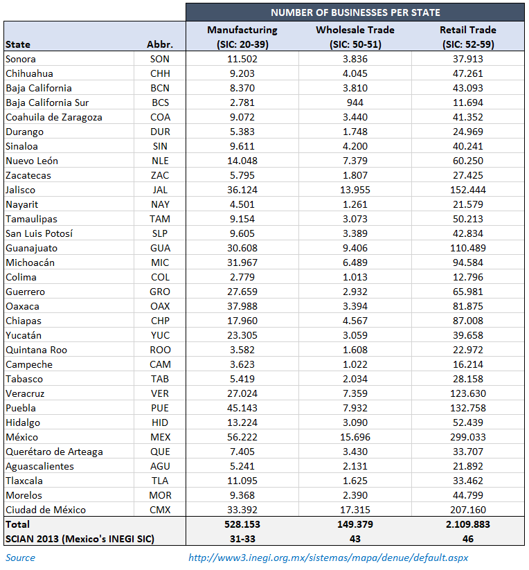
Well begun is half done but at this point, we should consider one thing: This infographic will be used in presentations so the values we gather should show accurate results. In order to make sure that the values are reliable, we got some help from one of our Mexican friends for better understanding the Mexican economy and gathering the correct data.
As a result, we’ve prepared this table according to different industries like Manufacturing, Wholesale Trade, and Retail Trade:
After that, we’ve created three Mexico Heat Maps by putting each statistics here with copy paste:
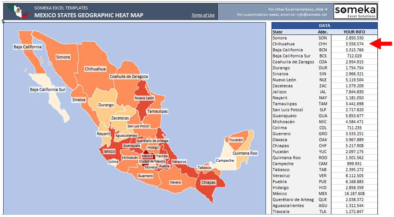
It’s so easy, isn’t it?
Finally, we’ve compiled these heat map images under a single document and made a few finishing touches for a cool presentation.
Here is the result of our work:
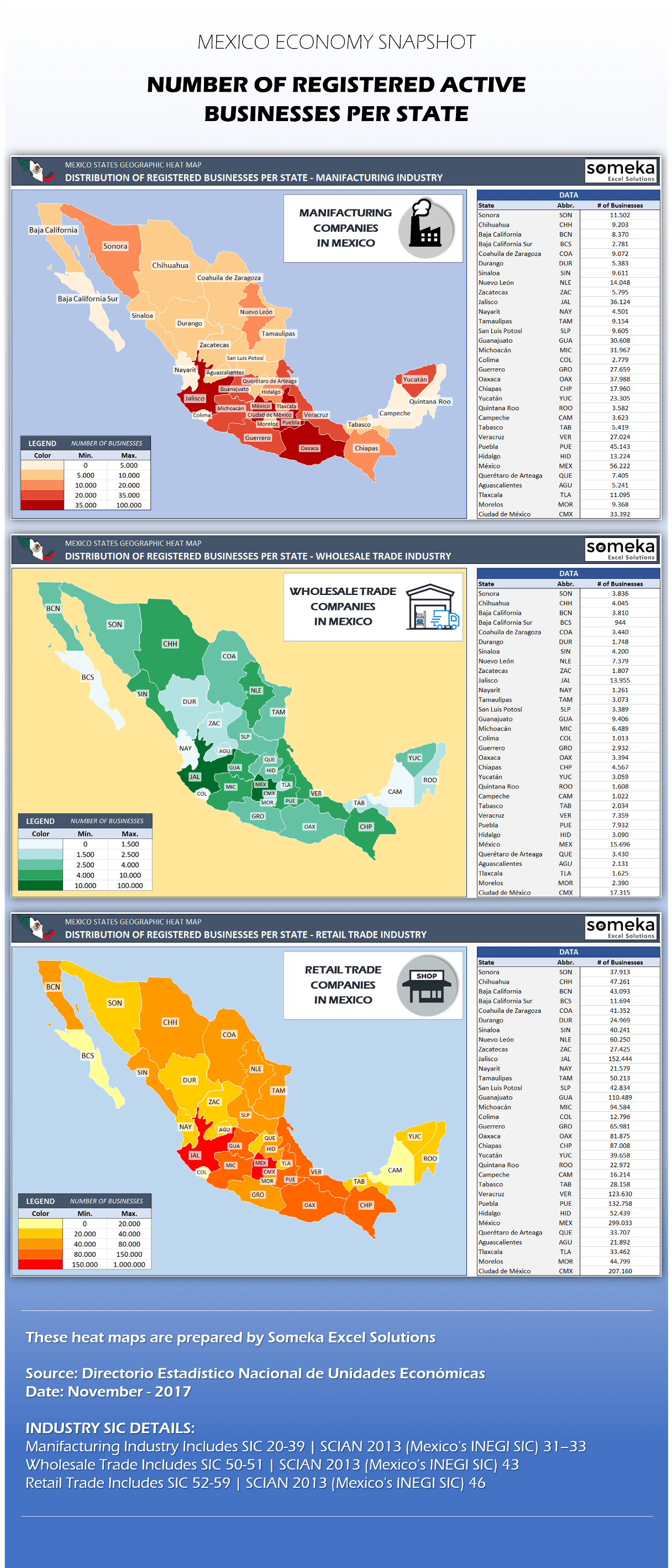
It is a professional, well-organized data presentation for your professors in college or top executives in a company. Probably their eyes will glow! The concept is very simple. As you see, we have just copied the data into our ready-to-use template. Similarly, you can create your own infographic heat map in a few minutes!
This was an example of how you can use a geographic heat map to create a professional infographic for our customer. You can check the details of our Mexico Heat Map Generator.
Lastly, If you want to view our other Geographical Heat Maps you can find them here:
Don’t show only boring statistics, let’s keep up with new presentation tools that will surprise your audience!
Related Posts