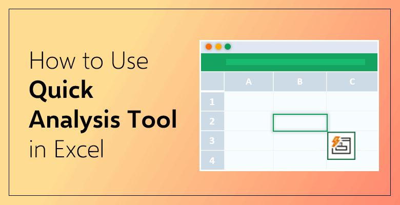
How to Use Quick Analysis Tool in Excel?
Excel always wants you to do your work as quickly as possible, hence provides such features and puts them into your service. Quick analysis tool is one of those. In this article, we will examine the quick analysis tool in Excel and what can be done by using this function.
First let’s see how to use Quick Analysis tool in 60 seconds:
What Is The Quick Analysis Tool?
Quick analysis is a practical Excel tool which lets user to instantly create different types of charts and offers options like conditional formatting, pivot tables or sparklines. You can find the tool appears any time you select a set of cells. It offers you various options and is a very helpful tool when it comes to analyzing data in Excel. Let’s see how it is used.
How to Turn On / Off Quick Analysis Tool in Excel?
Quick Analysis button shows up in the lower-right bottom whenever you select a range of data on your Excel sheet. It allows you to click and browse through its options. However, you must first activate the tool if it is not already turned on. Or, you can turn it off if you don’t want to display this tool. For both, you need to go to the “File” tab on the Excel menu and click “Options”. Then, on the General tab you will see “Show Quick Analysis options on selection” is written. Check its box to turn on the tool or uncheck if you want to turn it off.
Keyboard Shortcut
There is another, even shorter, way to activate the quick analysis tool. Instead of going through the tabs and selecting options, you can easily press “Ctrl+Q” on the keyboard and the quick analysis will appear.
How to Use Quick Analysis Tool?
Once the quick analysis tool appears at the bottom corner of the selected cells, it offers you the options as formatting, charts, totals, tables and sparklines. You can explore the options by clicking on the icon.
Insert Formatting to the Data
Conditional formatting is used for visualizing the values in your data by highlighting the certain parts. You can either add data bars or color your cells or use other options. After clicking the quick analysis button, select “formatting”. It shows all the options under the tab: data bars, colors scale, icon set, greater than, top value and clear.
Formatting is what you are looking for if you have a data to highlight. Color option allows you to insert different colors to your data; you can color them in order to differantiate and distinguish. In case you have some numbers and you want to see how they are valued based on a criteria, then icon set is there for you. By adding icons to your numbers, you can see how their values change. If you want to do more with your numbers, there is the option to highlight the cells which is greater than a particular value. Click on the “greater” on the tab and it will open a window that you can enter your constraint value and choose the formatting color. Afterwards, all the values greater than that will be colored.
Insert Chart to the Data
One of the most practical sides of quick analysis tool is that it allows to insert a chart into the spreadsheet. Select the data and then click on “charts” from the options the tool displays. Then all you need to do is to insert your chart and it is ready. It will do the analysis for you saving you from various efforts.
You can take this Sales Dashboard Template as an example. This Excel template includes sales tracking dashboard with pivot tables and charts so you don’t have to create them from the scratch. Just insert it and adjust your data, it is ready to use with its outstanding features.
Analyze Through Totals
Another thing that you can do under quick analysis tool is to insert “totals” to your data. It can be used for both rows and columns; a new row or column will be inserted once you select one of the options. First make sure that there is an empty row below the selected data. Totals tab provides you a wide range of formulas such as sum, average, count, % total, running total etc. Especially when you have big numbers to analyze; it is too hard to calculate their sum, find the avarege value among them or count them. That is why totals tab is useful for. Select the data you want to analyze, go to the quick analysis tab and pick from the formula varieties. Thanks to that function, you can easily work with your numerics.
Analyze Through Tables
Quick analysis allows you to insert tables which help you sort, filter and summarize data. With this one, a range of data will be converted into a table form. This function gives you also the pivot table option which could be highly important for many purposes. The table option works in the same way as other ones; go to the analysis tool select “tables” from the tab. You will see “table” and “blank”. The pivot table comes under the blank section and when you select the blank, the pivot table will be inserted in a new sheet.
Analyze Through Sparklines
From the quick analysis tool, you can insert sparklines which are mini charts placed in single cells. They come as the form of line, column or win/loss. To add sparklines, you need to select “sparklines” option then click on the sparkline you want to insert. The mini charts will be displayed into cells.
Let’s look at this Kanban Board Template which helps you to measure the performance of any act. In this template, you can see the added sparklines in the database part. This sparkline here is created to represent the performance over percantage. It can be seen how much a work is done by reading the mini chart.
It is simple to learn how to use quick analysis tool in Excel. Whether analyzing your data through total and tables or inserting charts into your sheet, this practical tool will save you time anyhow.
Excel is supportive and helpful when it comes to quick analysis. What about other functions? You can find the quick analysis tool under your hand; but if you want to do more than that, Excel is still here for you with so many other functions. You can train yourself with the Formulas Training Kit which would enable you to gain hand-on experience. Because it is learned best when doing. The kit has beginner, medium and advanced levels so that you can choose your level, then start learning and practicing the most commonly used Excel formulas. It gives you real-world problems to solve, teaching how to approach them like a pro and guiding you with detailed explanations. You will not only learn important Excel formulas by using this kit, but also sharpen your skills more than ever.
Related Posts