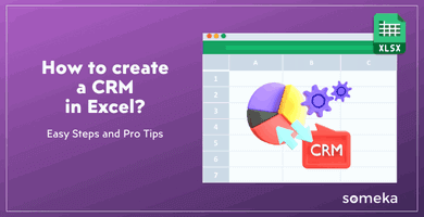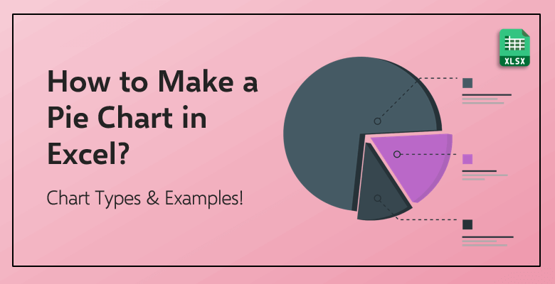
How to Make a Pie Chart in Excel?
What is a Pie Chart?
Pie charts are circular graphs that exhibit the rate of different individuals, products, objects and categories. It, unsurprisingly, gets its name because it is shaped like a real-life pie desert. And each slice of the pie represents each object’s contribution to the overall total of 100%.
Each component of the pie (that means each of the slices) are meticulously calculated to represent their comparison to other components in the pie. The pie mostly deals with the percentage rate while visually illustrating the comparison of data in a data group. This meticulous calculation demands that every one percent (1%) of a component carries in the pie, it corresponds to an angle of 3.6 degrees.
The circular pie and each of the pie slices sound fun. Let’s look at some of the reasons why it is one of the most used types of charts around the world by everyone.
Why Does Everyone Love Pie Charts?
One of the most important reasons that a pie chart is a highly used chart type is that it is visual. Of course, every graph can be considered visual, but a pie chart represents the data in a much clearer and illustrated way.
Also, it is actually a scientific fact that people love the pie shape. And the reason: Because it is circular! Even though your experts on visualization or design in your company might hate the pie chart, everyone loves it and they love seeing it!
It is said by Manuel Lima who is the writer of the book called The Book of Circles, the circle shape represents unity and perfection to almost every person who sees it. Everyone wants to see shape as a whole, even if they are working on that chart and processing complicated data. It gives everyone a different kind of satisfaction to transfer their numerical data into a whole visual shape. And on top of that, they can customize their graph endlessly if they are using Microsoft Excel to create it!
A pie chart shows the relationship between the different components. This data comparison can also work if you do this process with only numerical data. But, do you prefer looking at numbers or lavish and colorful visuals illustrated as a pie chart? Your choice.
What Is Used For? What Is NOT Used For?
Perhaps the most important term when you are talking about pie charts is ‘part-whole’. This term can sometimes be referred to as ‘part of a whole’ or ‘part to the whole’. This term represents a ratio which a selected percentage or a rate is compared to the total percentage or the overall number. In order to make it much easier to understand, let’s give it an example:
Imagine you have established a company with your partner. And you decided you are going to divide the profit as 60 to 40. You will be getting 60% of the total profit and your partner will get 40% of the profit. The pie chart for the division of profit in your company would look like this:
Your 60% cut and your partner’s 40% cut, each represent ‘a part of a whole’. Therefore, pie charts are one of the best tools in order to illustrate your ‘part-whole’ calculations, comparisons and divisions. It shows the relationship between the two (or more) separate data in the data set.
The other reason is the visual aspect of a pie chart. In order to see the clear difference in size between the different components, using a pie chart would be the right way. This way, it becomes much easier to read and understand the chart compared to only numerical data. Hence, seeing a clear small and big sized slice of a pie is an easier demonstration of data that everyone can process.
Tips on NOT to Do in Your Pie Chart
- Keep it One Hundred: Always try to get your components to add up to a 100 (percent). Not only is it complicated and somewhat impossible to understand, but also it is just plain wrong.
- Too Many Components: Try to avoid using too many components, thus, using too many slices in your pie chart. The color-coding, differentiating between the components and reading it can turn into a nightmare. If you can, try not to include more than eight slices.
- The Right and The Wrong Color: One of the best parts about creating and using a pie chart is the coloring. The use of different colors is essential. They help to differentiate between the different components and their data. That is why it is important to choose various colors carefully. Try to avoid similar and colors that are nearly the same in their tone in order to eliminate any confusion.
- Sorting Changes Everything: Sorting your components based on their different values changes the whole pie chart. If you list your various components alphabetically, you are going to get a different pie chart compared to listing them in the descending order. Make your order meaningful. Sort your components in such a way that it makes the data set easier to understand, not more confusing to the reader.
How to Make A Pie Chart in Excel
In order to create a colorful and professional looking pie chart, the first element you would need is the data itself. You need to gather up your data and put it in an Excel spreadsheet as a table. So, let’s look at the first step:
Step 1. Enter your data
If you want to create an optimal and an ideal pie chart, you should be including only one row or only one column to put your data in. This can seem counterproductive and unlike the other types you can create in Microsoft Excel; however, minimizing the row and the column number actually makes your pie chart better.
It can also help you to put the name of the category on top of your data set. For the majority of this blog post and especially in this chapter, you are going to see an example of how to create your pie chart: Imagine you are managing a restaurant. And at the end of every workday, you need to separate the tips to your staff. In order to successfully and fairly to do that, using percentages and creating a pie would be a crucial tool. Let’s enter the essential data. Of course, do not forget the add the name for your categories in order to avoid any confusion and any mix up:
As you can see the tips of your restaurant is divided into five separate components:
Manager gets 40% of the tips. Waiters get 32%; bussers get 18%; the kitchen staff gets 7%. And the remaining 3% of the overall tip is donated to various charity organizations.
As it was mentioned above in the previous chapter, if you can, try to keep your components (the slices of your pie chart) between 7 to 9. And while you are doing that, double-check on it if you have left any empty rows or columns in your spreadsheet, before you create your pie chart.
Step 2. Create your pie chart
Then, select all of the components with its accompanying percentage. Click the “Insert” tab right at the top of the toolbar. There, you are going to see the “Chart” section and also, the “Pie Chart” symbol:
Excel offers you more than one pie chart option which you can read the detailed explanations later in the chapters below.
A simple 2-D Pie Chart would look something like this:
Step 3. Format your pie chart
Now that you have created your simple pie chart, it is time to format it. One of Microsoft Excel’s biggest strengths is the ability to customize every little detail in your charts and graphs. As you can see below, you can customize almost every color you can see in the pie. You have the control to change anything in your chart to suit your wishes and desires.
The colors of your slices, the outline of the shapes and also, added shape effects can be found in the “Format” section in the “Chart Tools” tab in the toolbar:
As you can clearly see, you can also change the font type and the style in the “Format” section as well. On the other hand, if you want to change how the pie chart looks in general, you are able to do that in the “Design” section.
Step 4. (You Can) Change the Type of Your Chart
As you have seen, Excel offers more than one way to create your pie chart and to change the general type of chart. As you can look at below, Microsoft Excel offers various different types:
All you have to do is to click “Change Chart Type” on the right-hand side of the “Design” section. You will be welcomed with “All Charts” and Excel’s “Recommended Charts”. You can easily change the type without deleting everything and starting all over with your data.
On the other hand, if you want to use a pie chart but you choose to change how it looks, Excel offers you three different categories of pie charts and five different designs. You can find each of the categories, designs and examples of them below in the later chapter. So, let’s list the different types of pie charts before you examine each of them:
2-D Pie:
- Pie
- Pie of Pie
- Bar of Pie
3-D Pie
Doughnut Pie
The Different Types of Pie Charts
2-D Pie Charts
- Pie
The simple 2-D Pie Chart is perhaps the most basic and at the same time the most used one. It is called a ‘simple’ 2-D pie chart; however, as you are going to see in the later chapter with Excel’s vast collection of customization tools, it does not have to be simple, if you do not want it to be.
- Pie of Pie
This type also functions as it shows the proportions of a whole with its slices. However, the difference from a simple 2-D pie chart is that this type of chart details the small percentage components of your data set. It separates them in another pie chart so that the small components with tiny percentages do not go unnoticed.
Do you remember the tips separated in the restaurant in the previous example? Let’s say that the 3% of the tips which was donated to various charity organizations is also separated into three different organizations. So, the pie of a pie chart of the whole data set would look something like this:
This type takes some of the smallest percentages and puts them together in the first pie. And then, separates and details them in another small pie which you can see at the right side.
- Bar of Pie
This is fairly similar to the previous type. But instead of another small pie, this type shows the small percentage of components in a bar chart:
3-D Pie Charts
The 3-D Pie Chart is almost identical to the 2-D one. The only difference is that it is in three dimensions. Even though it can look as it took more time to create than the other ones, it is created with only one click as well.
The designers and the people who use circular graphs with their presentations are separated on whether they like 3-D charts or not. One group says that it looks more professional; however, the other group states that the more slices you add because of the 3-D shape, the chart will be more confusing and harder to read. What do you think?
Doughnut Chart
This doughnut-shaped chart is used instead of a 2-D or a 3-D pie when there are more components than you have expected. This means that doughnut charts function best when it is used to demonstrate multiple series establishing a whole. You can see the example of a doughnut chart with the tips of a restaurant example below:
In addition to other customization tools that you get from the other circular graphs, you can even adjust the hole size of the doughnut. Simply by clicking the doughnut itself, a window will appear on the right side of the screen. This tab is called “Format Data Point”. You can find more information and all the details in the next chapter below.
In the third section, you will see the angle options as well as the “Doughnut Hole Size”. By adjusting the percentage of the size of the hole, you can create different versions of the doughnut chart.
Customizing Your Pie Chart with Microsoft Excel’s Various Functions!
How to Add Data Percentage
The “Quick Layout” section located in the “Design” tab shows you different details which you can add to your pie chart. For example, clicking the first option is going to add the percentages of your components in the pie chart.
You can also click the add (+) symbol, chart title, data labels and a legend to your pie chart. You can also adjust the location and the details of your data labels from there.
How to Add Category Labels
You can also choose one of the options in the same section to add the category as well as the percentages. Simply clicking the first option in the “Quick Layout” section will bring the category (your components’) names and their percentages in your pie chart.
How to Change Colors
The “Design” section, also located in the “Chart Tools” tab, allows you to create as detailed a circular graph as you want. The “Chart Styles” lets you select one of the already built-in designs in Excel. Or if you want to customize the colors, “Change Colors” button will offer you ‘colorful’ and ‘monochromatic’ color sets for you to choose.
But you might not like the options and want to change every slice’s color by your own, you can do that as well! Only by clicking any of the slices, you will open a tab at the right side of the screen called “Format Data Point”.
You can adjust the filled color in the first tab. There are various options on how much and which way you can color your slices. The other tabs allow you to add shape effects on the slices and even change the angles which they are put at.
How to Move Your Pie Chart
Moving an image in Microsoft Word and relocating any of the charts and graphs in Microsoft Excel can easily turn into a nightmare. You can always “Copy” or “Cut” your pie chart and then, “Paste” into wherever you like. Or another option is to click the “Move Chart” button. After clicking that button, a window will appear and will ask you where do you want to move your graph to. You can select which chart you want to relocate if you have created more than one pie chart.
How to Sort the Slices By Their Size
In order to achieve this, you should be using one of Excel’s best built-in tools: Pivot Table. Select your data (with the category names included), click “Insert” at the top of the toolbar and then, select “PivotTable”.
Excel will create a Pivot table. But it will look messy and disorganized at first. In order to properly list and sort them, you need to click “AutoSort”. It is located right next to Row Labels. And then when you click “More Sort Options” and you will see a window like the one below:
You can put them into alphabetical order as well; but, sorting them based on their size in an ascending and descending order will help you more. After selecting the “Descending” order and clicking “OK”, your pivot table will look like this:
Then, as you are creating a new pie chart, just select the data as a whole and create the pie chart of your choice.
The best part about creating a pie chart with a data set in a pivot table is the refresh option. You can change the category and even the data itself (the percentage). Only by clicking refresh in the “Analyze” section of the “PivotChart Tools” tab, your pie will be refreshed with the new and updated information.
Chart Templates for Microsoft Excel
Sales Dashboard Excel Template
This interactive Sales Dashboard Template by Someka provides the most professional sales management you expect from an Excel template. You can enter “Product and Customer Data” which the template analyzes in order to create reports for you. In the template’s “Sales Data” section, you can input data in regards to your business’ invoice records. The categories you can put data in are the date of the invoice, customer code, the code of the product, the quantity of the purchase and the total amount of sales for a product.
All this essential information will provide detailed charts and graphs powered by Pivot tables. You can customize the details of the graphs and also, change the layout. The structure of the charts is also customizable if you want to adjust them to suit your own needs. This comprehensive dashboard shows your sales’ profitability, sales analysis and charts. It also automatically generates a monthly sales trend report, customer profitability report and a regional sales distribution report.
This template provides you the necessary charts and additional graphs and reports in order to analyze your company’s numbers. Unlike its inferior and expensive online competitors, this detailed template comes only with a reasonable price of $29.95!
Break-Even Analysis Template
Can you know if you are going to profit or fail when you establish a new start-up? You can only hope! However, beyond your hope, the revenue and cost assumptions of your business will be shaping your company’s future. Someka’s Break Even Analysis Template provides you with the necessary results and analyses in order to make you decide to invest in your own company or not.
The template has two sections: Financial Statement and Dashboard. In the Financial Statement section, you will be entering your financial data and the numbers necessary. The template itself will automatically calculate your business’ total cost, revenue and net profit.
The Dashboard section provides you a line graph in order to demonstrate the company financials, a cost distribution chart of your business and a bar chart. The Dashboard section is an overview of your company’s data for you to see if you can break-even. And the best part? It is completely free! Download it right now and start using it in Microsoft Excel.
Balance Sheet Template
The free Balance Sheet Excel Template by Someka generates financial reports based on their financial numbers. It calculates the financial ratios with its professionally designed structure. It provides essential insights into your company with locating problems in the accounting department and forecasting future financial profits and losses.
The current ratio, debt ratio, debt to equity to ratio and also, the working capital amounts are calculated automatically. You only need to enter the required data in regards to your business.
Excel Automatic Chart Maker Templates
Everyone uses different types of charts for different occasions and purposes. You might be using an Automatic Flowchart Maker in your workplace. Or you might create a Family Tree Maker in your personal life with your family members. The way you can create your favorite and required graphs is through Excel templates made by Someka.
All of these easy to use and ready to download Excel templates are essential tools for organizing and managing big and small data. You can process vast amounts of data in the low-cost alternative for other expensive competitors and comprehensive Automatic Flowchart Maker. Or you can create your family tree with photos in the Family Tree Maker. You can download and start using many different templates right now!
FINAL WORDS
It may seem as a complicated process if you have not created a pie chart before. However, inserting this simple graph would introduce a whole new visual aspect to your presentations and to your workflow. The best part about creating your pie chart and processing your data in Microsoft Excel is that every detail of your pie chart is customizable. You are able to create the right chart for you and exactly the way you want only by a few basic clicks!
Related Posts