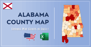
Excel Map Charts and Heat Maps
Map charts are one of the most engaging ways of geographically present your data for the analysis and reporting. It generally aims to enhance understanding of audience by combining geographical information with any kind of ata.
Let’s check this category to explore trends in your data across regions and develop more accurate strategies for your business!